- compare things between different groups (e.g. the number of orders you have by product type)
- track how a number changes over time if you have a smaller number of x-axis values (e.g. number of new users per month over a year).
Stacked bar chart
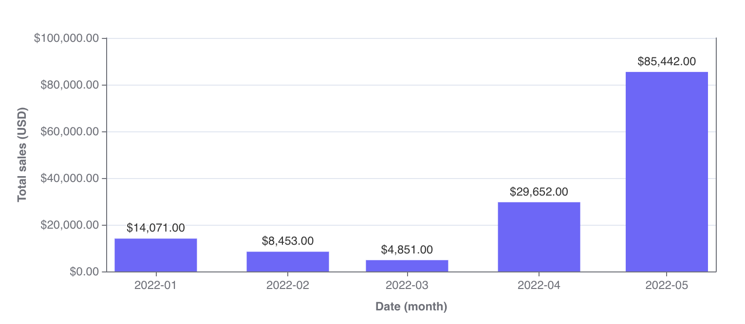
- the focus of the chart is to compare the totals and one part of the totals. It’s hard to compare bars if they don’t start at the same baseline. So, if you’re trying to build a chart to compare multiple parts of your total with each other, consider keeping your bar chart unstacked!
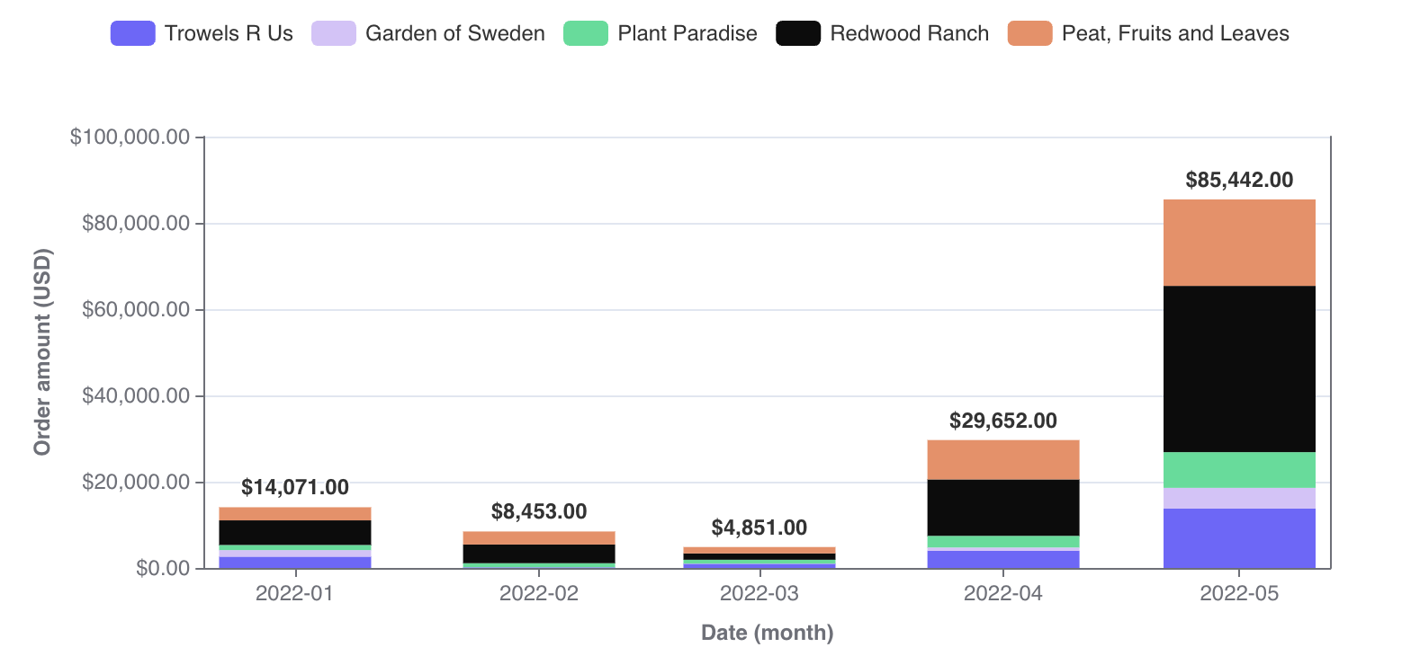
- you’re trying to show the parts of multiple totals. If you only want to show parts of one total, consider an unstacked bar chart instead. If you only want to communicate one part of one total, consider if you should be using a big value chart instead.
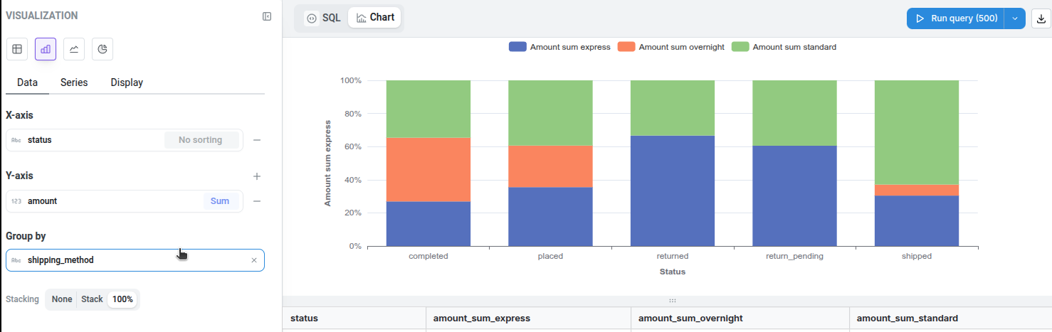
100% Stacked bar chart
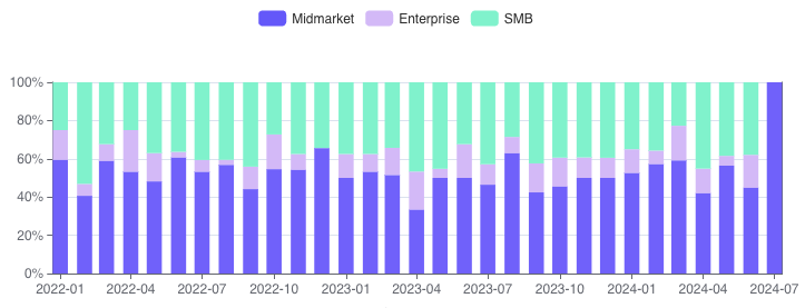
100% stacking option on the chart configuration. After enabling this option, we will automatically transform the data and the axes to display a 100% stacked bar chart.